| 雅思英语类别: 雅思口语,托福口语,日常英语口语,商务英语口语,以及幼儿英语口语。 同时本公司也承接雅思口语陪练,留学服务,雅思作文批改等业务。
如下为同学雅思原文: The pie chart shows the proportion of the energy produced from
different sources in a country between 1985 and 2003. The chart presents statistics of the source of produced energy over
the course of 1985 to 2003. According to the chart, the distribution has
dramatical changes from the year 1985 to 2003.
Oil is the most used source of energy of all time, albeit the proportion plunges to
39% in 2003 form 52% in 1985. Coming in second on the pie of 1985 is nuclear,
making up 22%, but then in 2003 it declined to 17%. Rounding about the top
three in 1985 is natural gas, which has a considerable increase during the
period from 1985 to 2003, rises to 23% from 13%. As regards to coal, it rises
to 13% from 8% during the 18 years. Last but not least, hydrogen remains the
same. 如下为外教修改后的作文: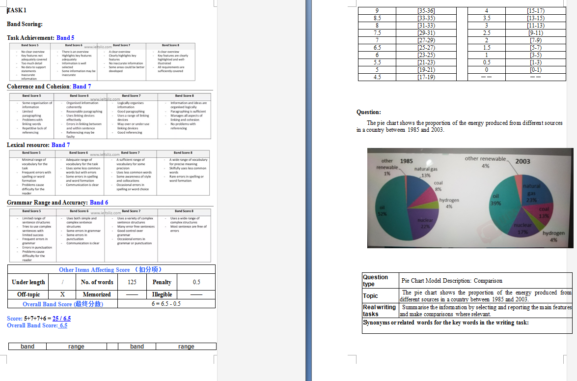  如下为下载链接(包含了同学原片以及修改后的,请下载后电脑查看,手机无法看到完整版):
雅思作文批改.rar |