雅思英语类别: 雅思口语,托福口语,日常英语口语,商务英语口语,以及幼儿英语口语。 同时本公司也承接雅思口语陪练,留学服务,雅思作文批改等业务。
如下为同学雅思原文: The following chart shows the total amounts of vehicle during the
period of time 2000-2020. The graph illustrates the figure of CO2 emission
caused and predicted to be caused by four different traffic forms. It is clear that traffic level climbs continuously, with a dramatic
rise since 2010, and will soar to 7millioms in 2020. Most carbon dioxide is
contributed by cars, following with tracks, vans, and buses. Tracks and cars
saw a similar trend in the graph. From the chart, traffic became crowded, grew from 2.5millioms in
2000 to 3.5millioms in 2010. Then, it shows a sharp increase as it projected to
reach its peak at 7 in 2020, which shows a serious position of the amounts of
vehicle. From the graph, car is always the main feature to blame for the
increasing CO2 production. It is above 2 millions of tones in 2000, and will
generate 3millions of tones in 2020. While tracks’ emission will go up from
approximately 0.75 to 1.25; vans’ rises from 0.5to 0.75 and will keep
stability. In addition, buses create least CO2 among these 4 kinds of
transportation means, and the amount is lower than 0.25millioms of tones all
the time.
如下为外教修改后的作文: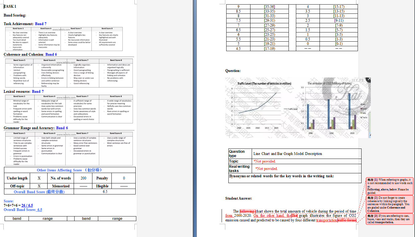  |