微信客服账号:
yingyu660
English
English陪练学习| 雅思英语类别: 雅思口语一对一陪练,托福口语,日常英语口语,商务英语口语,以及幼儿英语口语。 同时本公司也承接雅思口语陪练,留学服务,雅思作文批改精批等业务。 如下为同学雅思原文: The graph below shows the differences in wheat exports over three different areas. Write a report for a university lecturer describing the information shown below.
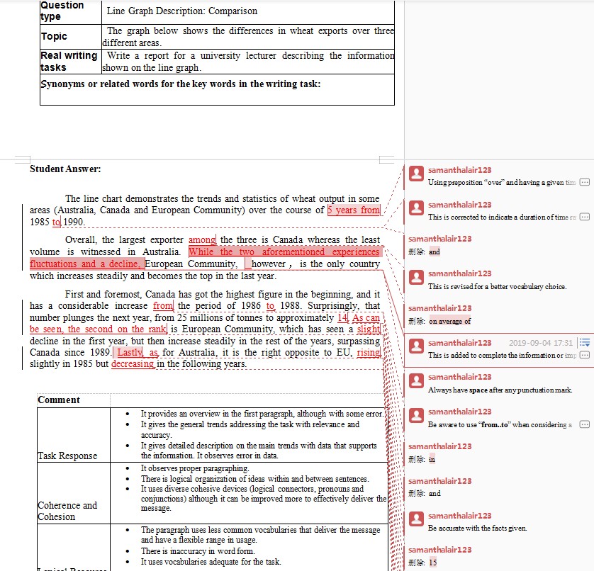
The line chart demonstrates the trends and statistics of wheat output in some areas (Australia, Canada and European Community) over the course of 1985 and 1990. Overall, the largest exporter on average of the three is Canada whereas the least volume is witnessed in Australia. European Community, however,is the only country which increases steadily and becomes the top in the last year. First and foremost, Canada has got the highest figure in the beginning, and it has a considerable increase in the period of 1986 and 1988. Surprisingly, that number plunges the next year, from 25 millions of tonnes to approximately 15. Coming the second of the graph is European Community, which has seen a slightly decline in the first year, but then increase steadily in the rest of the years, surpassing Canada since 1989. As for Australia, it is the right opposite to EU, rises slightly in 1985 but decreases in the following years. 如下为外教修改后的作文:
如下为下载链接(包含了同学原片以及修改后的,请下载后电脑查看,手机无法看到完整版): |


扫描二维码添加微信好友